PR Materials
"ISU's creativity, challenging spirit and customer satisfaction”

Symbol mark
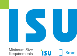
The solid wordmark of ISU Blue color representing youth, flexibility and trustworthiness and the square element of the ISU Green color that symbolizes state-of-the-art quality and environment expresses the will of ISU Group to develop into the world’s foremost innovative corporation boldly moving towards the future, embodied by the innovative diagonal shape in place of the rigid and tight-laced standardized state of the past.
-
Symbol Grid System
The symbol is the most important visual element that represents ISU group, and its use requires thorough management and control to form the image of ISU Group and to improve reliability. In principle, the reproduction of a symbol element should use the relevant document of the CD manual.

-
Subsidiary Signature
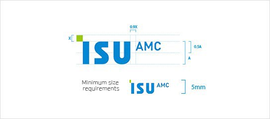
The Signature uses two elements, symbol and logo types, together. Careful attention is needed in its use as it plays the key role of publicizing ISU Group's subsidiaries within and outside of the company. When using the signature combining left and right, it is possible to use the left and right combined size if the size of the subsidiary’s Korean logo type is too large, or the width is narrow or the area is small.

In application, arbitrary modification is not permitted at all times, and it is necessary to request production to the ISU brand management team when modification or additional development of the signature is required.
Minimum space requirements
A certain margin must be secured in order to maintain the independent quality separate from other elements and to maintain the unique identity of ISU Group. It is not possible at all times to insert any other characters or graphic elements inside the margins surrounding the symbol and signature, and it is recommended to secure the largest margin possible. For English text signature combination, refer to the minimum space requirement of Korean text signature combination below.

Color system
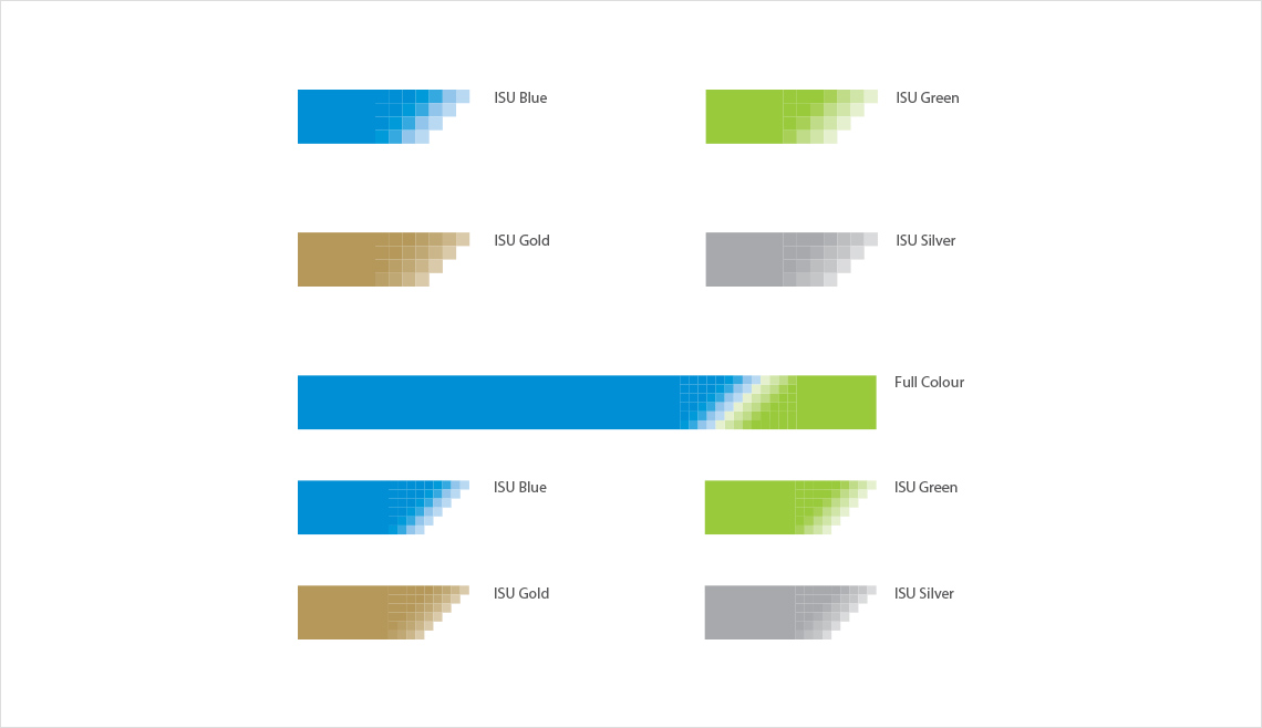
The ISU Color System is divided into primary colors and secondary colors. ISU Blue and ISU Green used in the symbol are called primary colors, while ISU Gold and Silver used for special situations and ISU Light Gray used for background color are called secondary colors. Careful attention is required when using them, as they can make differences in brightness and saturation depending on the type of expressive medium such as print or video. ISU colors should be presented in spot color in principle, and the one closest to the specified color must be used accurately when expressing 4 degrees / 3 degrees.

Graphic Motif Guide
Graphic motifs must be composed of four types of different colors or shapes to be used appropriately in various situations. During application, refer to the design of each item presented in the manual. TYPE C and TYPE D can be used in all cases where the width is small or the area is large or small. When using a motif, pay attention so that the size of the medium, the thickness and the area of the motif are considered


